

Hello There!
Let's collaborate to make a difference.
My Name is Hamda and I'm a Graphic Designer.
My passion to learn pushed me to travel across
the globe, all the way from Dubai to San Franciso.
My goal is to grow in the design field and find ways to positively contribute to our world.
If you'd like to work with me or have a question, please feel free to contact me.
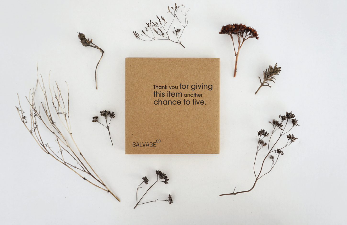
Salvage
Objective:
Develop a visual identity for Salvage, a brand focused on selling, recycling, and salvaging used items, that authentically reflects its mission of sustainability and giving used goods a second
Strategy:
Utilized a color palette inspired by the @Ecobranding CMYK Guide, to emphasize sustainability by reducing ink usage and
energy consumption. Incorporated typography that is variant in size to convey the idea of salvaging and giving new life to items. Integrated images that evoke a cut-and-paste aesthetic, symbolizing the salvaging process and showcasing the brand's commitment to reuse and recycling.
Both visual and verbal elements aim to convey the brand's dedication to making small sustainable design decisions and to encourage customers to participate in the mission of giving used items a new lease on life.
Credit →


